
Track 5–7 Advocacy KPIs That Predict Wins for Public Affairs Teams

Effective advocacy measurement uses a three-tier KPI model: activity, quality, and impact. Track five to seven KPIs immediately, including advocacy ask rate, activation and completion rate, advocate repeat rate, and verified contact rate. Formulas, staged benchmarks, and dashboard cadence follow below. This framework draws on the logic model approach favored by ORS Impact and the campaign-style methodology Amautapublicaffairs applies with clients.
TL;DR:
Tracking only activity metrics like email volume or social reach can create a misleading picture, as they do not necessarily predict meaningful advocacy outcomes.
Leading KPIs such as ask rate and contact rate guide immediate actions, while outcome KPIs like referral revenue or policy shifts reflect actual campaign impact.
Setting realistic targets requires classifying your program stage and customizing benchmarks for each cohort, rather than applying generic industry averages.
Using a balanced set of KPIs across activity, quality, and impact ensures an honest assessment of advocacy performance, avoiding overstatement of influence.
Automating data collection through integrated dashboards and regular KPI reviews enhances credibility and prevents reliance on vanity metrics.
Table of Contents
Top Advocacy KPIs: Definitions, Formulas, and Quick Benchmarks
Most program managers track too many metrics that feel meaningful and too few that actually predict outcomes. The KPIs below cover customer, employee, brand, and policy advocacy, and each one carries a formula you can put into a spreadsheet this afternoon. Several come from the tiered model that HighAdvocacy built for customer advocacy programs, adapted here to also serve public-affairs and coalition work.
Before the list, one framing point matters: some of these KPIs are leading indicators (they predict future outcomes and you can influence them directly), while others are outcome-oriented (they reflect results you can only partially control). Mixing the two without labeling them is how dashboards mislead leadership.
Pro Tip: Color code your dashboard by leading versus outcome KPIs. Leading metrics tell your team where to intervene this week; outcome metrics tell your board whether the strategy is working this quarter.
Advocacy ask rate. The share of your eligible base that receives an advocacy ask in a given period. Formula: (advocates asked ÷ total eligible base) × 100. Track monthly. Early-stage programs often have ask rates under typical industry ranges; growth-stage programs generally see ask rates approaching halfway of the eligible base. This is a leading indicator, and it is the first number to check when action volume stalls, because you cannot activate people you never asked.
Response or activation rate. The percentage of people asked who actually complete an action (sign a letter, share a post, attend a meeting, contact a lawmaker). Formula: (advocates who acted ÷ advocates asked) × 100. Track weekly during active campaigns. Early programs typically see activation rates in the lower single digits to low double digits; mature programs with warm, segmented lists generally see higher activation rates. This is a leading indicator and arguably the single most diagnostic KPI in the entire model, since it isolates whether your messaging and targeting are working independent of list size.
Completion rate. Of everyone who starts an action (opens a form, begins a call script), the share who finish it. Formula: (completed actions ÷ started actions) × 100. Track weekly. Low completion rates often indicate friction in the form or script design rather than issues with motivation. Leading indicator.
Advocate activation and repeat rate. The percentage of advocates who take a second action within a defined window (often 90 days). Formula: (repeat actors ÷ total activated advocates) × 100. Track quarterly. This is the number that separates a program with real depth from one that burns through a list once and never converts casual signers into a durable base. Outcome-oriented, though it can be nudged with better follow-up sequencing.
Review velocity. For customer and brand advocacy specifically, the rate at which new reviews or testimonials accumulate over time. Formula: new reviews ÷ time period (e.g., per month). Track monthly. According to HighAdvocacy’s staged benchmarks, early programs might generate a handful per month, while mature ones sustain a steady cadence tied to customer lifecycle triggers. Leading indicator.
Referral revenue. Revenue directly attributable to advocate-driven referrals, tracked through unique referral codes or CRM tagging. Formula: sum of closed-won deals tagged with a referral source. Track monthly or quarterly depending on sales cycle length. Outcome-oriented, and one of the few advocacy KPIs finance teams will accept without argument.
Review-influenced pipeline. The dollar value of pipeline where a prospect cited a review, case study, or advocate reference as an influence. Formula: sum of opportunity value tagged with an advocacy-influence flag. Track quarterly. Outcome-oriented, and useful for justifying advocacy program budget to leadership that thinks in pipeline, not sentiment.
Verified district match rate. In policy and grassroots campaigns, the share of advocate contacts confirmed to reside in the legislator’s actual district. Formula: (verified in-district contacts ÷ total contacts) × 100. Track continuously via your advocacy platform. Civiclick’s dashboard research treats this as one of the strongest predictors of legislative responsiveness, because unmatched or out-of-district messages get discounted or ignored by staff. Leading indicator, and arguably the most underrated metric on this list.
Contact rate. The percentage of targeted legislators or officials actually reached (call connected, email delivered and opened, meeting held). Formula: (successful contacts ÷ total contact attempts) × 100. Track weekly during active legislative sessions. Leading indicator tied directly to deliverability and list hygiene.
Legislator response quality score. A qualitative or semi-quantitative rating (often 1-5) of how substantively a legislator’s office responded, ranging from form letters to committed cosponsorship. Formula: average score across tracked interactions, scored by staff against a defined rubric. Track monthly. Outcome-oriented, and it is the metric that keeps a campaign honest about whether volume of contact is translating into political movement.
Advocate acquisition cost. Total program spend divided by new advocates recruited in a period. Formula: total spend ÷ new advocates. Track quarterly. Useful for comparing channel efficiency (paid social recruitment versus employee referral versus event sign-up), though it should never stand alone since a cheap advocate who never activates isn’t actually cheap.
Coalition or partner growth rate. The rate at which allied organizations, employee ambassadors, or community partners join your advocacy network. Formula: (new partners this period ÷ total partners at period start) × 100. Track quarterly. Outcome-oriented, and often the earliest visible sign that a campaign’s message is resonating beyond its original base.
That list is deliberately broader than any single program needs. Select several KPIs that best fit your advocacy type, activation stage, and stakeholder priorities, then focus your efforts accordingly.
Why Use a Three-Tier Model (Activity, Quality, Impact)?
A single KPI can lie to you. A basket of the wrong KPIs can lie to you in a more sophisticated way, which is worse. The three-tier model exists because activity, quality, and impact answer three different questions, and confusing them is the fastest way to overstate a program’s real influence.
Activity KPIs measure whether the machine is running at all: ask rate, number of actions taken, emails sent, advocates asked. Quality KPIs measure whether the actions that occur actually matter: completion rate, verified district match rate, contact rate, legislator response quality. Impact KPIs measure whether anything changed in the world because of it: referral revenue, review-influenced pipeline, cosponsorship counts, policy outcomes.
Here is the trap most programs fall into:
High activity with weak quality produces impressive-looking volume that decision makers privately ignore.
Strong quality without adequate activity means a well-tuned engine that nobody is fueling.
Impact claims built on a shaky activity or quality foundation collapse under scrutiny, because nobody can trace the outcome back to a credible input.
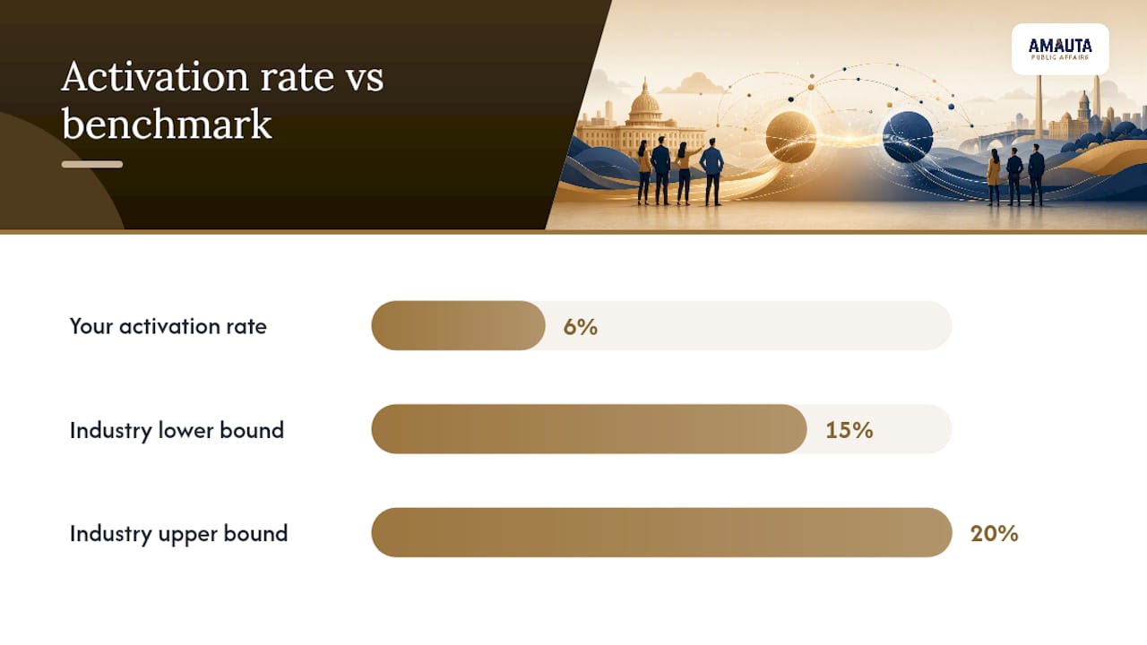
If your activation rate is 6% against an industry range closer to 15-20%, don’t jump to impact reporting yet. The fix usually lives in your ask framing, segmentation, or channel choice, not in a new impact metric that papers over the gap.
Pro Tip: When a KPI underperforms, diagnose one tier down before you touch messaging. A weak completion rate (quality) is often a form-design problem, not an activity problem, and no amount of new outreach will fix it.
ORS Impact’s guide makes a related point: a single indicator, chosen in isolation, almost always misrepresents progress. A balanced basket across all three tiers is the only honest way to report advocacy performance.
Setting Realistic Targets and Benchmarks by Program Stage
Benchmarking a six-month-old program against a five-year-old one is the most common way advocacy managers set themselves up to fail. Stage determines what “good” looks like, and skipping that step produces targets nobody can hit.
Classify your program stage first. Early-stage programs are still building the advocate base and testing messaging. Growth-stage programs have proven the model and are scaling activation. Mature programs have stable, segmented lists and predictable conversion patterns.
Set stage-appropriate ranges, not fixed numbers. HighAdvocacy’s staged benchmarks suggest early programs often see activation rates in the 5-10% band, growth programs in the 10-20% band, and mature programs above 20%. Use these as directional ranges, then adjust for your specific channel mix and audience warmth.
Customize by cohort, not just by program age. An employee advocacy cohort recruited internally will behave very differently from a cold public policy list. Segment your targets accordingly rather than applying one blanket benchmark across every group.
Run diagnostics when a KPI misses target. Ask: Is the ask reaching the right segment? Is the action itself frictionless, or does it require too many steps? Is the timing aligned with a real moment of relevance (a vote, a renewal, a news cycle)? Is the incentive or message resonant with this specific cohort?
Revisit benchmarks quarterly. A program that graduates from early to growth stage needs new targets. Holding a growth-stage team to early-stage benchmarks wastes the momentum they’ve already built.
The discipline here isn’t complicated, it’s just often skipped under deadline pressure: know your stage, set a range instead of a single number, and diagnose one tier down before changing strategy.
Attribution vs. Contribution: Choosing Credible Interim Outcomes
Strict attribution, proving your advocacy campaign was the sole cause of a policy change or a purchase decision, is almost never achievable outside a controlled experiment. Contribution is the realistic standard: showing your program was a meaningful factor among several. Innovation Network’s Pathfinder guide recommends exactly this shift, focusing evaluation on interim outcomes and formative learning rather than chasing definitive causal proof.
Interim outcomes worth tracking include:
Policy cosponsorship counts tied to your campaign’s target legislation.
Documented legislator position shifts, tracked through public statements or voting record changes.
Coalition growth, meaning new organizational partners joining your advocacy effort.
Public comment volume during regulatory or legislative comment periods.
Media coverage spikes that correspond with campaign pushes, tracked through media monitoring tools.
ORS Impact’s framework organizes these into six outcome categories: shifts in social norms, strengthened organizational capacity, strengthened alliances, a strengthened base of support, improved policies, and eventual changes in real-world impact. Most campaigns will only credibly claim the first five within a typical reporting window.
Interim outcomes aren’t a consolation prize for programs that can’t prove final impact. They’re the actual evidence base that lets a team course-correct before the multi-year policy fight is over.
Practical collection methods include timeline mapping (plotting campaign activities against policy milestones to show plausible sequence), direct policymaker ratings collected through structured interviews, qualitative evidence from staff and coalition partners, and systematic media and policy tracking. Pathfinder’s methods guide treats these as complementary, not substitutes for each other.
Designing an Advocacy KPI Dashboard and Review Cadence
Two dashboard views serve two different audiences, and collapsing them into one screen is how leadership meetings devolve into arguments about definitions.
The executive view carries five to seven outcome-linked KPIs: referral revenue, review-influenced pipeline, cosponsorship counts, coalition growth, and legislator response quality. The operational view carries the diagnostic metrics your team actually manages day to day: activation rate, completion rate, verified district match rate, and contact rate, broken out by channel and segment.
Cadence | Audience | Core content |
Weekly | Operations team | Activation rate, completion rate, contact rate, friction diagnostics by channel |
Monthly | Program manager | Ask rate trends, repeat rate, review velocity, cohort comparisons against stage benchmarks |
Quarterly | Leadership and stakeholders | Referral revenue, review-influenced pipeline, cosponsorship and policy movement, coalition growth |
Governance keeps this from drifting into chaos:
Maintain a definitions registry so “activation” means the same thing to sales, comms, and the policy team.
Assign a data owner per KPI, the person accountable when a number looks wrong.
Run a quarterly formula audit to catch calculation drift as tools or fields change.
A logic model tying activity to interim outcomes to long-term impact should sit at the top of the executive dashboard as a one-page reference, so anyone reviewing the numbers understands what each tier is supposed to predict.
How Amautapublicaffairs Applies KPI-Led Evaluation in Practice
Amautapublicaffairs builds its client engagements around exactly this logic: activity, quality, and impact tiers evaluated continuously, not reported once at the end of a campaign. The firm’s campaign-style approach sequences community engagement, media relations, and digital advocacy so each phase produces measurable interim outcomes that feed the next.
That means:
Community engagement work gets scored against verified participation and sentiment shifts, not just event headcounts.
Media relations tracks coverage volume and tone against the specific narrative goals set at campaign launch.
Digital advocacy is measured through activation and completion rates segmented by district, employer, or coalition affiliation.
Every engagement includes real-time feedback loops so underperforming tactics get adjusted mid-campaign rather than diagnosed in a postmortem.
A typical starter engagement runs as a KPI audit of existing data sources, followed by a pilot dashboard built around the tiers most relevant to the client’s project, then a three-month review to validate targets against real performance. For land use, energy, and infrastructure clients specifically, that structure connects directly to how advocacy communications support civic leaders navigating permitting and public comment processes.
Ready to Turn KPIs Into a Working Dashboard?
Building the KPI list is the easy part. The harder problem, the one that stalls most programs, is wiring your advocacy platform, CRM, and policy tracker together so the numbers update automatically instead of living in a spreadsheet someone rebuilds by hand every quarter. That’s the gap Amautapublicaffairs closes for developers, government entities, and nonprofits running land use, energy, and infrastructure campaigns.
Amautapublicaffairs’s team designs the dashboard structure, defines your data owners, and sets stage-appropriate targets so leadership sees outcome-linked KPIs instead of raw activity counts. For projects navigating complex permitting or community opposition, that means tailored public affairs consulting that treats measurement as part of the campaign strategy from day one, not an afterthought bolted on before a board meeting. Land use and infrastructure clients in particular benefit from Amautapublicaffairs’s project-specific advocacy experience, where verified engagement data often determines whether a project clears its next hearing.
If your current dashboard tells you activity but not whether it’s working, request a KPI audit from Amautapublicaffairs and get a pilot dashboard built around the tiers that actually matter for your project.
The Mistake That Costs Programs the Most Credibility
The biggest error I see in advocacy measurement isn’t a missing metric. It’s treating a vanity number, total emails sent, follower counts, page views, as if it were predictive of anything. Vanity metrics feel productive because they’re easy to grow and easy to report. But growing an activity number that never converts to quality or impact just produces a bigger version of the same problem.
Here’s the corrective habit: pick two KPIs per tier, six total, and review them every week, not just at quarter’s end. That weekly rhythm catches a broken funnel before it becomes a quarter of wasted spend.
— Ignacio
Sources
You don’t need an enterprise stack to measure this well, but you do need each tool doing the job it’s actually built for. Council Fire’s evaluation guide groups the necessary categories into reach and engagement tools, outcome and impact tracking, and ROI measurement, integrated rather than siloed.
The minimal stack looks like this:
The join between advocate identity and outcome is where most programs lose data integrity. Use consistent UTM parameters on every outbound link, a dedicated CRM field for policy tags, and deduplication routines run monthly, not annually. Verified district matching deserves particular attention in policy work, since an unmatched contact is functionally invisible to a legislative office. Deliverability checks (bounce rates, spam flags) should run alongside every major send, because a broken pipe upstream will quietly deflate every downstream KPI. A partner specializing in community engagement measurement can help structure this data collection for programs that lack an in-house analytics function.
Recommended
Comments